

Link copied

In the same way that you can’t judge a book by its cover, you can’t tell how good or bad a record is just by looking at its sleeve either.
Some of the worst country records of all time actually look quite appealing sitting in the record store racks, and likewise some of the best country albums have some embarrassingly bad cover art.
Just last April, we got the fright of our lives when we opened up our mailbox to find White Buffalo, the brilliant new album from Ian Munsick, waiting for us. Which got us thinking - what are some of the worst country album covers of all time?
So, we’ve gathered together the best of the worst - a mix of strange settings, ludicrous outfits, weird facial expressions and terrible fonts.
Enjoy.

Garth Brooks - Garth Brooks & The Magic of Christmas
Garth Brooks has always given off a magician vibe. I’m sure Trisha has noticed it. She probably hasn’t said anything to him because men are sensitive about that sort of thing, but still, Garth must wake up every morning and look in the mirror and think, ‘Jesus Christ, Garth, we look like a magician!’"
He unknowingly leans into it on the cover of Garth Brooks & The Magic of Christmas, holding a fortune teller’s crystal ball and looking beguilingly into the camera. Presumably it’s just because the album title has the word “magic” in it, but it still detracts slightly from the whole ‘tis the season to be jolly of it all.
George Jones - I Wanta Sing
For the cover of George’s 1977 album, I Wanta Sing, he bizarrely chose to be painted as the front of a tour bus; like a particularly terrifying episode of Thomas the Tank Engine where George the Tour Bus drives recklessly into Music City and crashes into a bar on Broadway and has to be rescued by Butch the Tow Truck.
“George is a wild, unsteady bus who lives at the big bus station in the city of Nashville,” you can imagine Ringo Starr narrating as he explains the strange new character to younger viewers. “He's a mischievous little vehicle with a wide unnerving smile and crazed eyes, and an unreliable engine that often boils over. He tends to be somewhat highly strung and prone to not showing up when he’s supposed to.”
Later on in the series he’ll have to explain how, following the end of his troubled marriage to Tammy the Tank Engine, George had to undergo an extensive rebuild, giving him a new shape and a thankfully much improved performance.
Old Dominion - Old Dominion
The cover of Old Dominion’s self-titled third album is giving, “we completely forgot to get a photo taken for the album cover so when we got the email reminding us we quickly removed all the furniture and wall fittings from our manager’s office and just did the photoshoot in there.”
Simple ideas can sometimes work, but if you go too simple you could end up looking like camera assistants who are only sitting there to check the lighting, while the photographer waits for whoever it is who’s actually having their photo taken to arrive.
Dorothy "Everybody's Mother" Freyberger - Goes Country
Packed with hits like ‘Too Old to Cut the Mustard’ and ‘Big Fat Gal’, Dorothy Freyberger needed an album cover that left it in no doubt that when it comes to country music, she means business. Although it’s not clear if the shotgun is meant for the listener or the horse.

Marcy Goes to Nashville
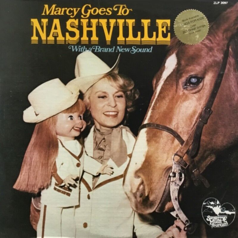
Oh shit. Marcy is the doll! She’s the fucking creepy doll. And she’s on her way to Nashville. Presumably to go on some sort of killing spree like that ventriloquist dummy does in that film with Anthony Hopkins. Starting with this poor little horse. We’ve got friends in Nashville. We need to warn them!
Waylon Jennings - Ladies Love Outlaws
They may well do, Waylon, they may well do. But that isn’t a lady. That is a very small child.
John Bult - Julie's Sixteenth Birthday
John Bult’s one and only LP, Julie’s Sixteenth Birthday, should have been the first of many, but sadly he’s only famous now for one thing: its terrible album cover.
Although at first it might look like a record about a middle-aged man hitting on an underage girl in a bar and keenly anticipating the day she reaches the legal age of consent, it actually takes its title from a super depressing country ballad in which a drunken father accidentally kills his own daughter in a car crash on her sixteenth birthday.
According to John, the original idea for the album artwork had been just a photo of him sitting with his guitar, but his producer Teddy Broussard talked him out of using it.
“Ted met this girl at a restaurant,” he remembers, “and asked her parents if he could use their daughter on the front of my album.”
The cover photo was taken at a restaurant in Lake Charles, with Bult sitting at a table, holding the hand of Kim Whitehead, a sad looking 16-year-old girl, with a wedding ring on his hand. When the final album was pressed, and John Bult saw the finished product, he was livid.
“I told him I didn’t like the look of it one bit. Instead of looking like a dad and his daughter, it looks like some guy trying to pick up a chick in a bar. Nobody is going to know that is supposed to be Julie. I didn’t like it one bit.”
Unfortunately, he was absolutely right.
Luke Combs - This One's For You
“It will look like a magnificent stained-glass window,” the art department of Columbia Nashville will have assured him. It didn’t. It looked like a Wetherspoon’s carpet.
Brad Paisley - Play (The Guitar Album)
At some point between Brad Paisley’s third and fourth album, the singer decided he was fed up with getting other people to do his sleeve design and took it all in-house, with varying degrees of success.
It was around this time that “Brad Paisley – cover design, packaging concept” began appearing in his liner notes. Although he struggled at first with his rudimentary photoshop skills and hilariously literal design concepts, in 2008 he came up with the surrealist masterpiece that was the artwork for Play (The Guitar Album).
Paisley began using collage techniques of irrational juxtaposition to violate established expectations and rationality. In his piece Play (The Guitar Album), Paisley interrogates the fundamental concept of what it is to create an album cover by placing a playground slide next to a barn and sitting an electric guitar on a child’s swing, mirroring the construction of dreams as a direct manifestation of unconscious thinking, whilst offering a prismatic reflection of the social change and upheaval of country music in the late twentieth century.
Sadly, he didn’t put as much thought into his choice of fonts.
David Allen Coe's Discography
Sometimes an artist produces work of such terrible quality so regularly that one album cover alone isn’t enough to honour their achievements.
David Allan Coe has done more for terrible album cover art than any other artist in country music history, and it’s only right that he should be recognised here as having not just one, but multiple worst country album covers of all time.
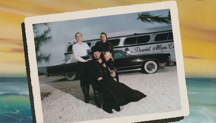
Even for an artist known for his odd album covers, the cover of his 1978 album, Family Album, is still something truly extraordinary. The year after he released the Texas Moon album, which featured him and his touring brand mooning the camera on the cover, he put out one of the weirdest of all of his very weird album covers. It features Coe dressed as a church minister with a long black flowing cloak and a terrified little blonde girl in his lap, while two out of his three wives at the time stand behind him, with his black Lincoln Town Car and Silver Eagle tour bus behind them.
Photographs of all three of Coe’s wives are included on the album’s inner sleeve, along with a photograph of the singer smiling which is even more disturbing than the album cover.
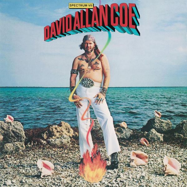
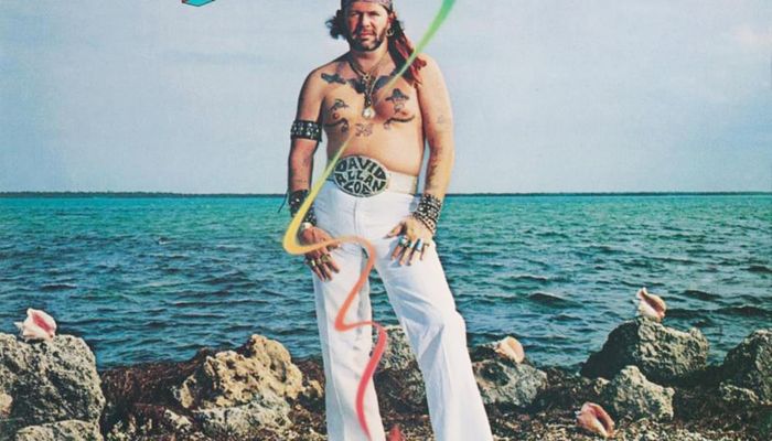
He was on a roll, though, and a year later he released Spectrum VII, an album of ocean themed songs, the cover for which naturally had Coe posing shirtless on a tropical beach inexplicably surrounded by conch shells and what could possibly be the world’s first ever fire emoji exploding at his feet.
Coe continued to redefine bad cover art throughout his career, peaking perhaps with the cover of the 1986 album Son of the South, which features a long-haired Coe, sitting, holding his baby son with a confederate flag draped over his shoulders.
“His use of the flag was always in the, ‘It means rebellion, not racism,’ way,” says the baby on his lap, the now 37-year-old host of the Cocaine and Rhinestones podcast, Tyler Mahan Coe. “It’s totally ignorant and divorced from the actual meaning, but it’s the same thing all kinds of people still believe and repeat. If I was a little older than two, I probably would have said it was dumb and we shouldn’t do it.”
The album also marked the first time fellow outlaw legends Waylon Jennings, Willie Nelson and Jessi Colter appeared on a David Allan Coe record. Presumably they all agreed to it before they’d seen the cover.


