


Link copied
Country music has a hard time crossing over. Although passionately adored by its own fanbase, it’s difficult to think of any other genre that elicits such universal disdain when people are asked about their music tastes. Even the most broad-minded of listeners will often describe their music tastes as enjoying anything except for country music.
For many years, musicologists have debated the reasons for country music’s inability to cross over and appeal to a mainstream audience. But, after minimal research and having found very little actual evidence, it’s been discovered that the issue is directly linked to the fonts that country artists have been using on their record sleeves; often appearing confusing and culturally illegible to a non-country audience.
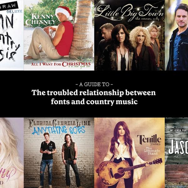
With that in mind, Holler investigated 10 of the most widely used font styles in country music to find out if there was any evidence to this theory, and to discover the secrets behind the typefaces. Here are 10 fonts and the truth.
Aldean Monotype
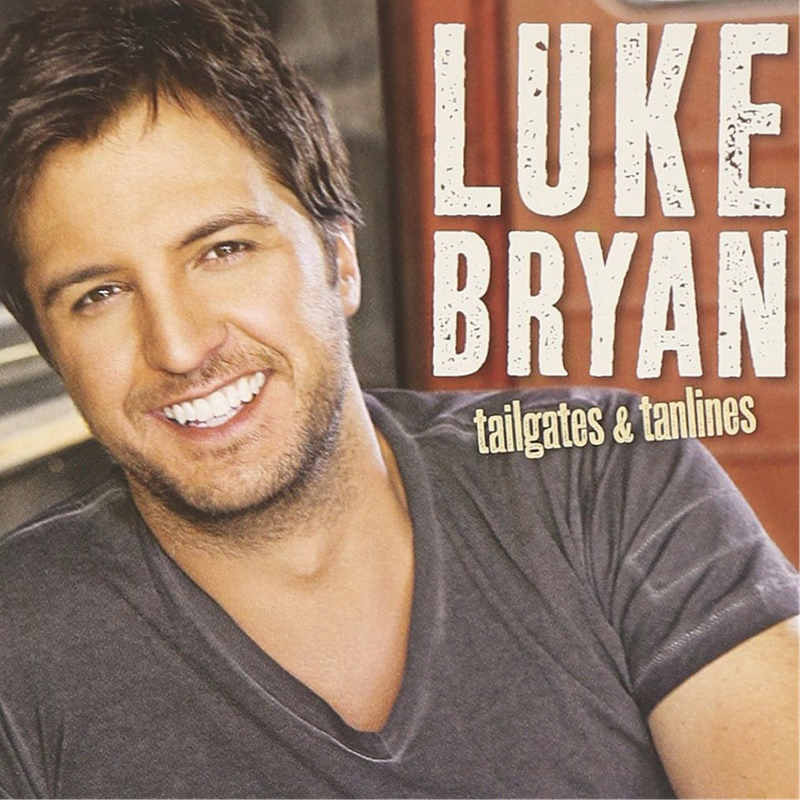
Like the singer it takes its name from, Aldean Monotype is a rugged and manly condensed sans serif font, first used by Jason Aldean on the cover of My Kinda Party in 2010. Its distinctive worn out effect matches Jason Aldean’s faded boot cut jeans and the weather-beaten wooden props he stands in front of on the cover.
Aldean Monotype is the kind of a font that can only be used by a real man when he simply has to get the job done and nothing else will do. It’s a Bruce Willis in Die Hard kind of font. A font for the man who likes chopping wood and grilling steaks and Fast And Furious movie quote-alongs. The kind of font that forgets your birthday but you still love it anyway.
Aldean Monotype is often used whenever an artist wants to signify a sensitive but red-blooded, heavy-duty masculinity. Luke Bryan and Kip Moore have both used watered down variations of it.
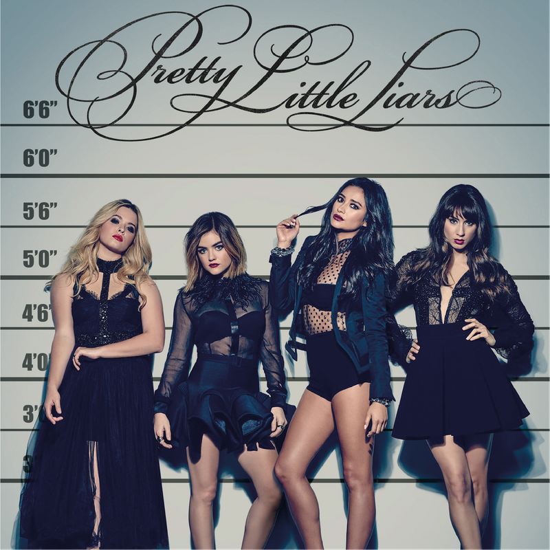
Karen Gothic Light
An elaborate script typeface based on the lettering of eighteenth century writing masters - a variant of which was popularised by the seemingly never-ending teen drama Pretty Little Liars – it’s the kind of font you would proudly draw out in sixth grade after you’d been studying the Tudors for a term.
With its hints of Copperplate and Chancery, the font originally took its name from Karen Fairchild, the singer of Little Big Town, who first used it on the cover of their album The Reason Why. It has a small town, fairy tale wholesomeness to it undercut with a dark sense of foreboding.
You can imagine the words “Live, Laugh, Love” painted out in Karen Gothic Light on a driftwood wall hanging, swaying in the breeze alongside a feathered dream catcher in the window of a bric-a-brac shop by the sea. You can almost taste the waves and the white wine spritzer in the air come five o’clock.
But be careful, things are not always what they seem. There are dark secrets hidden behind its sultry flourishes.
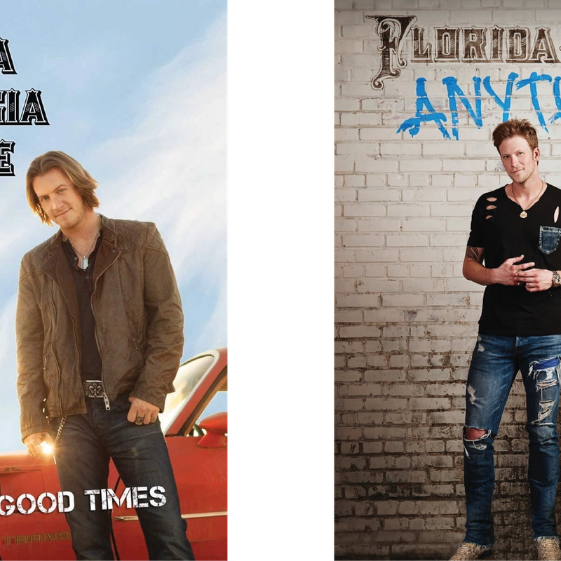
Florida Georgia Linotype
Like the music of the band that invented it, this font is a bizarre and distasteful mix of two entirely different and uncomplimentary styles. What appears to be an ornamented Tuscan font for the letters “LORIDA”, “EORGIA”, and “INE” is combined with a mid-nineteenth century ornamented dropped capital for the letters “F”, “G” and “L”.
It’s a head-on collision between the wild west and Steampunk - adding spray paint lettering, a stencil font and a felt-pen-on-masking-tape font to the covers of their first two albums to confuse typographers even further.
Released in 2012, their blending of hip hop, rock and country music and the combination of fonts used on their album Here’s To The Good Times is now widely considered by experts to have been the first sign of the apocalypse.
A Child's Handwriting
Although not a font as such, children’s handwriting has always been a very popular lettering choice in country music. In the 1950s and 1960s, childhood country stars like Ricky Skaggs and Dolly Parton would often earn extra pocket money by designing the album covers for busier adult artists like Buck Owens and Tammy Wynette, doing the handwriting and most, if not all, of the colouring in for them.
In the 1970s – along with rope lettering and the dismantling of the Nashville studio system - children’s handwriting on album covers became less fashionable, with artists preferring to use adults to do their lettering, but in recent years there has been a definite resurgence.
Although he only found fame as a recording artist in 2018, Mason Ramsey already had a reputation in Nashville for having some of the neatest handwriting on Music Row. By the time he was discovered in Walmart singing Hank Williams songs at the age of 11, his handwriting had already been used on covers by Kenny Chesney, Eric Church and Florida Georgia Line.
In 2019, Ramsey got his big break in the artwork world when he drew and coloured in the letters on the cover of Luke Combs’ What You See Is What You Get album cover, except for the B and the K, which he still finds too hard.
Even more encouragingly, in recent years, grown up country artists have been practicing their own handwriting too - Morgan Wallen has written both his name and the album title for his two albums so far!
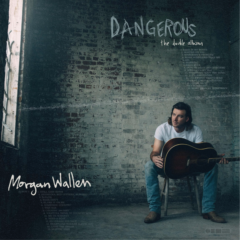
Chalkboard Psychopath
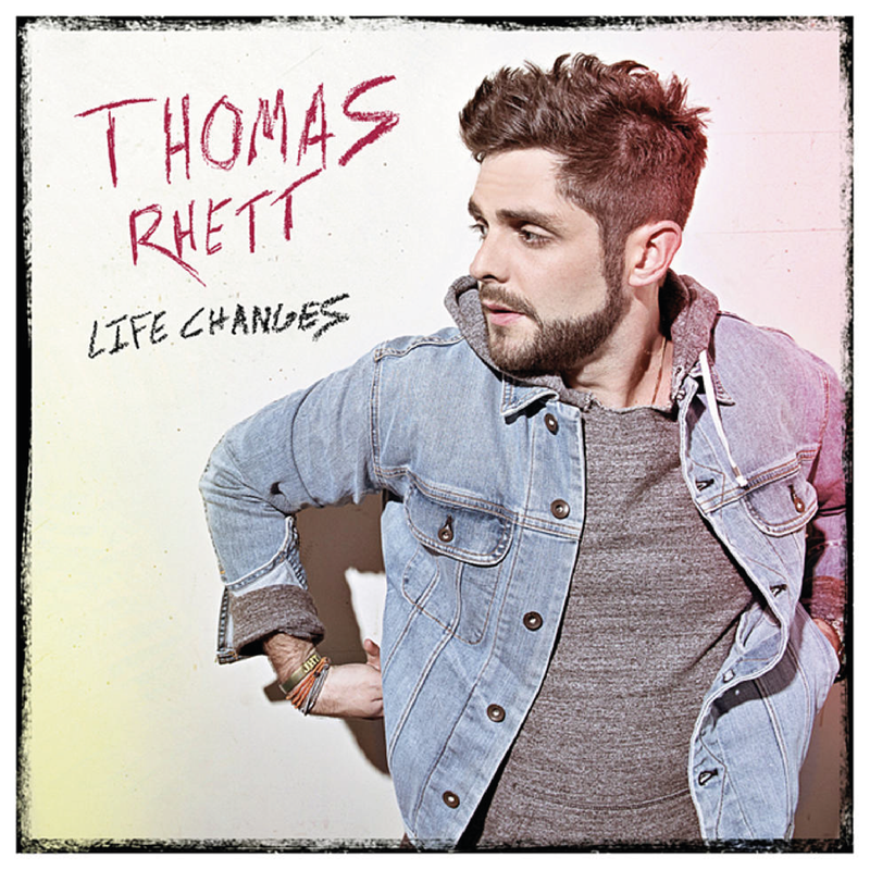
As well as doing his own handwriting for the cover of Dangerous, Morgan Wallen has also made use of one of country music’s more terrifying typefaces for its title. The word “DANGEROUS” is typed out in a scratchy variation of Chalkboard Psychopath.
Originally a hand-drawn font developed by Eric Church for his Mr Misunderstood album, since its introduction in 2015, a number of other variants of the unhinged psychopath font have been adopted. Thomas Rhett in particular had great success with a red ink version for his album Life Changes.
For the cover of Damn Country Music, Tim McGraw decided to counter-balance the maniacal smeared finger ink lettering of the title by using the reassuringly organised Trixie font, which replicates the lettering of a Dymo label maker. The combination of the two fonts is strangely reminiscent of those anti-piracy adverts you used to get at the beginning of DVDs reminding you that you wouldn’t steal a handbag, and somehow makes Tim McGraw look like even more of a psychopath.
Lambert Old Style
Also known as Mum’s Best Handwriting, this is a warm and homely build-your-own-website kind of font - not dissimilar to Fairchild Gothic Light, but without any of its sinister undertones. Softly feminine with hints of Prosecco, the font takes its name from Miranda Lambert, who was the first to use it for her album The Weight Of These Wings (although typographers often note that a loose variant of it had already been used by both Shania Twain and Taylor Swift on their early albums).
Similar to the sort of fonts you might find on candle packaging or treatment menus in a relaxation spa, it became known as ‘Mum’s Best Handwriting’ due to its similarity to the sort of handwriting mothers would use when they were writing formally; perhaps to a newspaper about a local issue or in a letter to your Aunty Val. As emails replaced handwritten letters as the main form of correspondence for mums, Lambert Old Style became the internationally recognised standard font used in the headings for annual family newsletters.
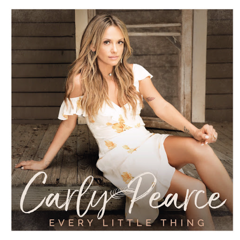
Carly Pearce and Kelsea Ballerini have both enjoyed great success mixing Lambert Old Style in with more condensed contemporary fonts in recent years, and Hallmark have a full range of bereavement cards that also use the font.
Western Saloon
Another font favoured by Miranda Lambert - particularly when performing as a member of the hellcat country throwback trio Pistol Annies – Western Saloon is a bold curvaceous typeface, similar to Lambert Old Style but tighter and augmented, with flowery detail and flourishes on the key letters. With its shapely well-rounded lettering and hints of the American Old West, it’s especially popular with neo-traditionalist country artists and Disney princesses.
American Typewriter
Oh. Turns out this is actually a real font. Oh well, country singers absolutely love them. After all, nothing says honest-to-goodness authenticity like a fake typewriter font.
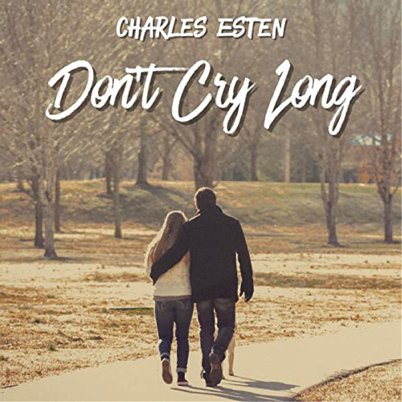
Charles Esten
Nowhere else in country music has the troubled relationship with fonts been played out more colourfully than in the single cover artwork of Charles Esten. Over the course of 64 singles (yes, SIXTY FOUR!), Esten has exemplified such a confusing use of fonts that he’s become a style of his own. Often known for his revolutionary use of mixed fonts, its thought that he chooses his typefaces by opening PowerPoint and closing his eyes and using whichever font happens to be open.
The artwork for his single ‘When It’s True’ combined two uncomplimentary handwriting fonts with an American Typewriter font – the word “TRUE” typed so large that it would have needed a typewriter the size of a house to type it. 64 singles in and it doesn’t look like he’ll be giving up on the typographical experimentation any time soon. God knows what he’ll use for the cover if he ever makes an album.